Inside the Qliro App – designed for user excellence and speed

We’ve just launched a refreshed Qliro app. While it might look like a visual update at first glance, it’s actually much more than that behind it. To get the story behind the new design, we spoke with Sofia Moberg, Product Manager for App & Web at Qliro.
A CLEAR MISSION TO PUT THE USER FIRST
This refresh isn’t just about updating the app's look. The starting point was a clear mission: to leverage modern frameworks, power the experience with AI, and create something that truly puts the user first. Because payments shouldn’t feel complicated. They should feel clear, intuitive, and in control.
“We set out to make the experience intuitive, consistent, and truly aligned with the Qliro brand. Every detail is designed to help users instantly understand what to do and feel in control,” says Sofia Moberg, Product Manager App & Web at Qliro.
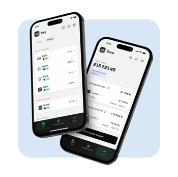
The result? A faster, more intuitive app built to guide users by highlighting the right things at the right time. An experience designed to reduce friction, increase clarity, and make it easier to stay on top of your finances.
FROM INTERFACE AND DESIGN TO EXPERIENCE AND GUIDANCE
This update goes beyond visuals and into how the experience works, moment by moment. We’ve focused on creating a more guided experience, helping users instantly understand what needs attention and what’s already taken care of.
After all, this is about people’s personal finances. Something that's both personal and often sensitive. In other words, less guessing and more clarity. Sofia adds:
“It’s about guiding users at the right moments. Surfacing what matters, removing uncertainty, and making the experience feel effortless from start to finish.”
So, What's new?
Here are some of the key improvements in the refreshed app:
✔️ Cleaner, more modern design: Guides you to take the right actions quickly and confidently.
✔️ More intuitive experience: Simplifies navigation so you have total control and feel assured every step.
✔️ Smarter guidance: The app highlights when something needs attention and when everything is handled.
✔️ Seamless end-to-end experience: Ensures a consistent shopping journey so you always know what to expect.
✔️ New design system: Updated colors, typography, and components for faster, more consistent product iterations.
✔️ Improved accessibility: Makes the app easier and more enjoyable for everyone to use.
Built to evolve
One of the biggest shifts behind the scenes is the foundation we’ve built. With a modern design system and improved ways of working, we can now move faster, iterate more often, and continuously improve the experience.
That means this launch isn’t the finish line, but rather a starting point. As Sofia sums it up:
"We’ve built a strong foundation for what’s next. I’m incredibly proud of what the team has achieved and excited to keep shaping the smarter way to pay."
This is just the beginning. We’re already working on what’s next – with a continued focus on simplicity, speed, and complete user control. More updates are on the way, all designed to make Qliro the smarter way to pay (to quote Sofia again!).
Stay tuned.
👉 Download the app (App Store, Google Play), explore the new experience, and tell us what you think.